
Coffee first. Everything else second.
CHALLENGE
A Bay Area institution since 1966, Peet’s Coffee had made very few changes to its brand in over a dozen years. The brand had become dated and no longer reflected the current state of the company: innovative, modern, and premium.
Peet’s underwent a brand refresh to revitalize its brand platform. As part of this work, we made an intentional shift to focus on the heart and soul of Peet’s: Coffee. We changed our original name from Peet’s Coffee & Tea to Peet’s Coffee. An update to its brand identity ensued, and a few select works can be seen below.
PROJECT
BRAND REFRESH
BRAND STRATEGY
BRAND IDENTITY
CREDITS
AGENCY PARTNER:
CHARACTER
PHOTOGRAPHER:
NOEL BARNHURST
BRAND IDENTITY REFRESH
BEFORE

AFTER

BEFORE

➞
AFTER

DESIGN STRATEGY
Once the brand identity was completed, we quickly updated two of our core brand vehicles:
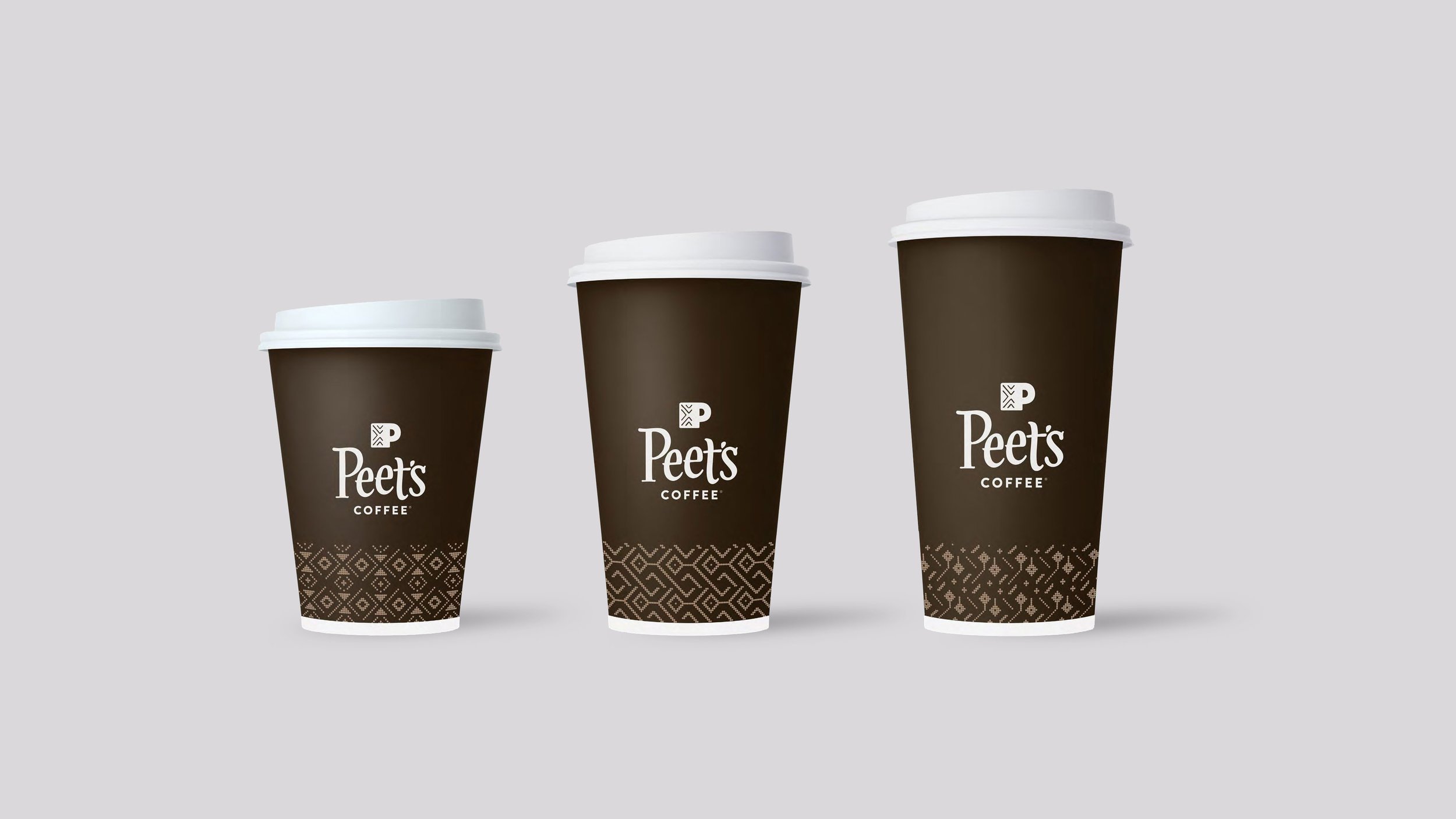
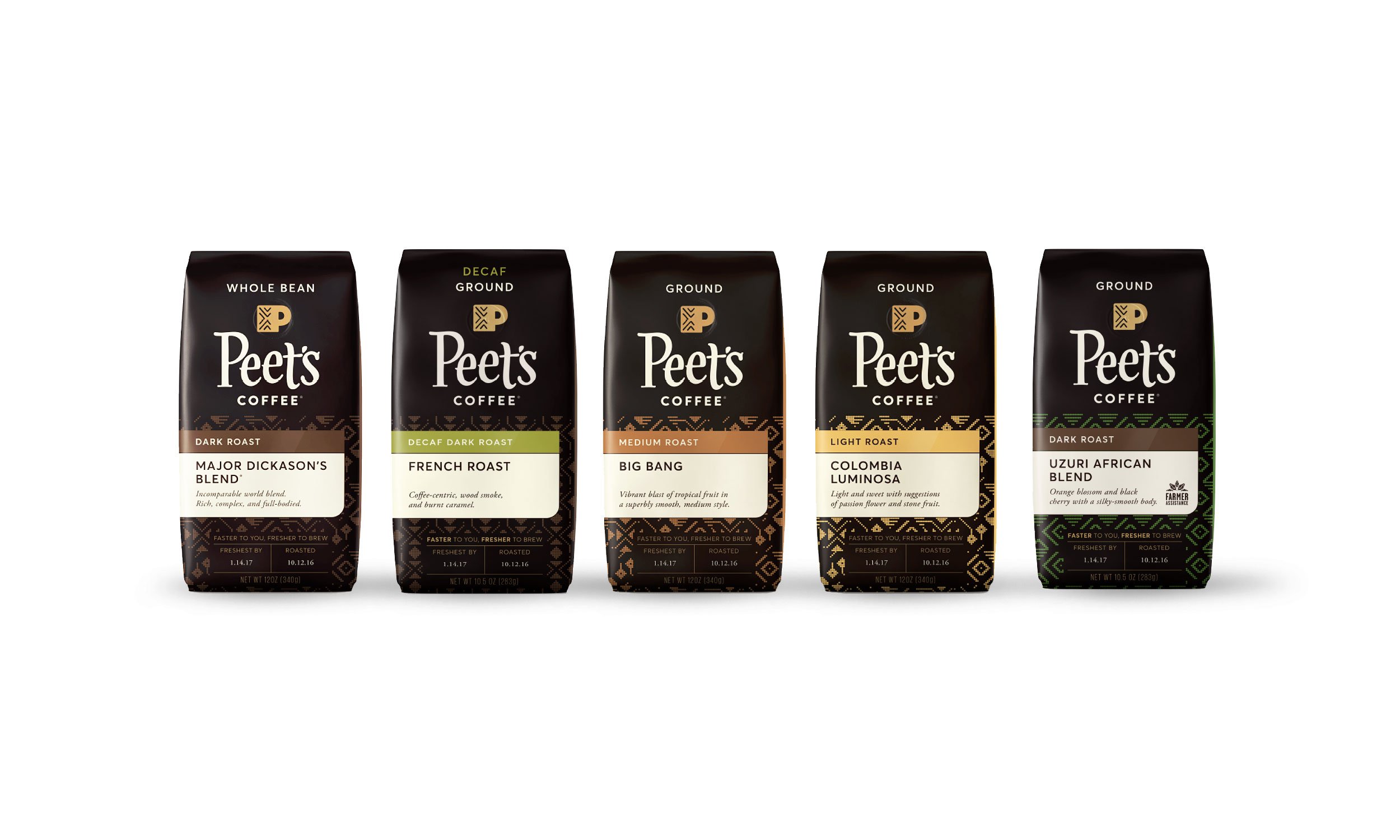
Our Retail hot cups had been white since day one. Research showed that white cups can, for some people, signify “cheap”. We leaned into the equity of the Peet’s Brown for a warmer, richer, and more sophisticated look, and revisited the visual language of our coffee patterns to create modern, more refined versions to use on the cups. For our CPG packaging, we created stronger branded elements to increase its impact on the shelf. We used the Peet’s brown and new origin patterns for consistency and brand equity, established a bright contrasting area large enough to emphasize flavor notes, created a design system for coffee type to increase shoppability, and incorporated copy that highlighted freshness, a key differentiator.
NEW SIGNATURE LOOK
As Creative Director, part of my role was to evolve and elevate the brand, drive brand consistency across all channels throughout the company, work with agency partners on brand initiatives, lead an internal creative team, and approve all creative. During this time I defined and created a new signature look & feel for Peet’s with an update to the brand photography, typography, color palette, and visual language that could be maintained throughout all seasonal creative and across all channels in both digital and print. Here are a few examples...
PROJECT
BRAND REFRESH
CREDITS
INTERNAL:
CREATIVE SERVICES
PHOTOGRAPHY
BEFORE – VARIOUS
AFTER – NOEL BARNHURST
BEFORE

AFTER

CASE STUDY
50TH ANNIVERSARY CAMPAIGN
Challenge: Peet’s was hitting an exciting milestone in the history of its existence: 50 years. We wanted to celebrate and highlight Peet’s passion and commitment to the craft of coffee, the roasters, employees, and to its loyal Peetniks in ways that showed pride and gratitude.
Solution: To honor our 50th anniversary, we joined forces with an external agency, Cutwater, to create a brand campaign that we leveraged and expanded upon throughout the year. We focused on Alfred Peet’s dedication to his craft as the originator of the craft coffee movement and highlighted what we have held true for the past 50 years.
PROJECT
BRAND CAMPAIGN
CREDITS
AGENCY PARTNER:
CUTWATER
INTERNAL
CREATIVE SERVICES
PHOTOGRAPHY
NOEL BARNHURST
